Note: This is a project I completed for U.T. Austin’s Post Graduate Program in AI & Machine Learning: Business Applications. The data and business scenarios are part of a simulated case study and do not represent the actual operations of any real-world entity.
Project Overview
My goal for this project was to get hands-on practice visualizing data using Python.
Setup
To begin, I imported the Python libraries I will use for this project:
- Pandas for managing the data.
- Matplotlib and Seaborn for visualizations.
import pandas as pd
import matplotlib.pyplot as plt
import seaborn as sns
Understanding the Data
The data is a CSV file contaniing information on various automobiles (make, engine type, mpg, etc.). I imported the data into a pandas dataframe.
df = pd.read_csv('/Automobile.csv')
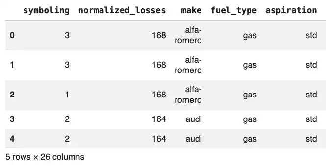
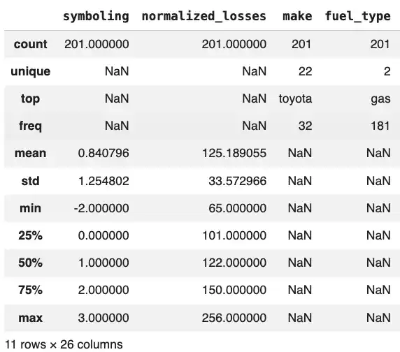
To get a quick understanding of the data, I used the head(), shape(), info(), and describe() functions.
The head() function shows the first five rows by default.
df.head()
>>>
The shape function tells me that the data consists of 201 rows and 26 columns.
df.shape()
>>> (201,26)
The info() function displays the name, count, and data type for each column.
df.info()
>>>
RangeIndex: 201 entries, 0 to 200
Data columns (total 26 columns):
 #   Column               Non-Null Count  Dtype
---  ------               --------------  -----
 0   symboling            201 non-null    int64
 1   normalized_losses    201 non-null    int64
 2   make                 201 non-null    object
 3   fuel_type            201 non-null    object
 4   aspiration           201 non-null    object
 5   number_of_doors      201 non-null    object
 6   body_style           201 non-null    object
 7   drive_wheels         201 non-null    object
 8   engine_location      201 non-null    object
 9   wheel_base           201 non-null    float64
 10  length               201 non-null    float64
 11  width                201 non-null    float64
 12  height               201 non-null    float64
 13  curb_weight          201 non-null    int64
 14  engine_type          201 non-null    object
 15  number_of_cylinders  201 non-null    object
 16  engine_size          201 non-null    int64
 17  fuel_system          201 non-null    object
 18  bore                 201 non-null    float64
 19  stroke               201 non-null    float64
 20  compression_ratio    201 non-null    float64
 21  horsepower           201 non-null    int64
 22  peak_rpm             201 non-null    int64
 23  city_mpg             201 non-null    int64
 24  highway_mpg          201 non-null    int64
 25  price                201 non-null    int64
dtypes: float64(7), int64(9), object(10)
memory usage: 41.0+ KB
The describe() function provides statistical information for each colum (e.g. mean, standard deviation, quartiles, etc.)
Visualizing the Data
I used Seaborn to create graphs to visualize the data.
Histogram
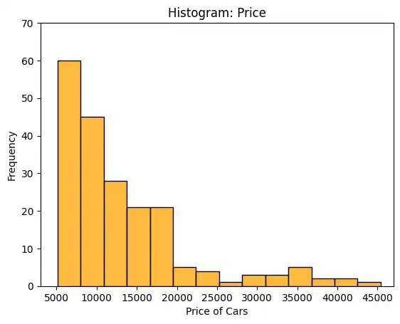
The histplot() function produces a histogram. I used the ‘price’ column for the x axis, resulting in a histogram that groups the automobiles (the 201 rows) by price.
sns.histplot(data=df, x='price')
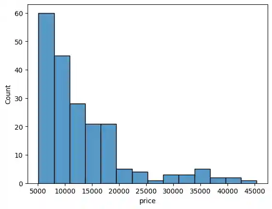
I improved the appearance of the graph by including additional parameters (e.g. title, x and y axis labels, and custom coloring).
plt.title('Histogram: Price')
plt.xlim(3000,47000)
plt.ylim(0,70)
plt.xlabel('Price of Cars')
plt.ylabel('Frequency')
sns.histplot(data=df, x='price', color='orange')
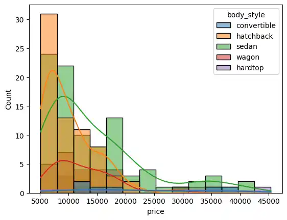
I further enhanced the graph with information on body style.
sns.histplot(data=df, x='price', kde=True, hue='body_style')
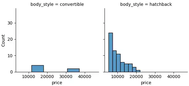
I used the FacetGrid() function to create price histograms for each body style.
g = sns.FacetGrid(df, col="body_style")
g.map(sns.histplot, "price")
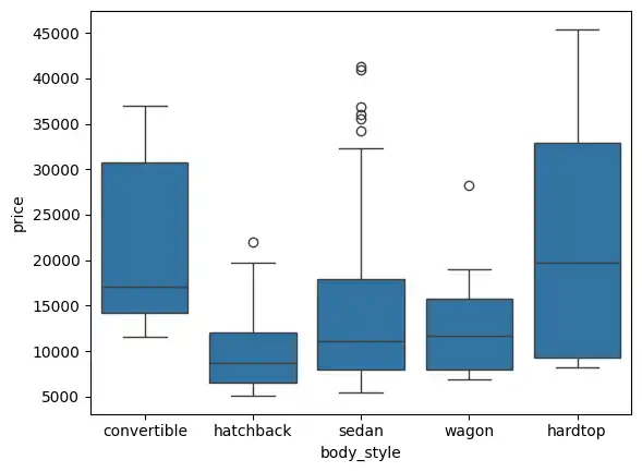
Box Plot
I used the boxplot() function to create a box plot for each body style.
sns.boxplot(data=df, x='body_style', y='price')
Count Plot
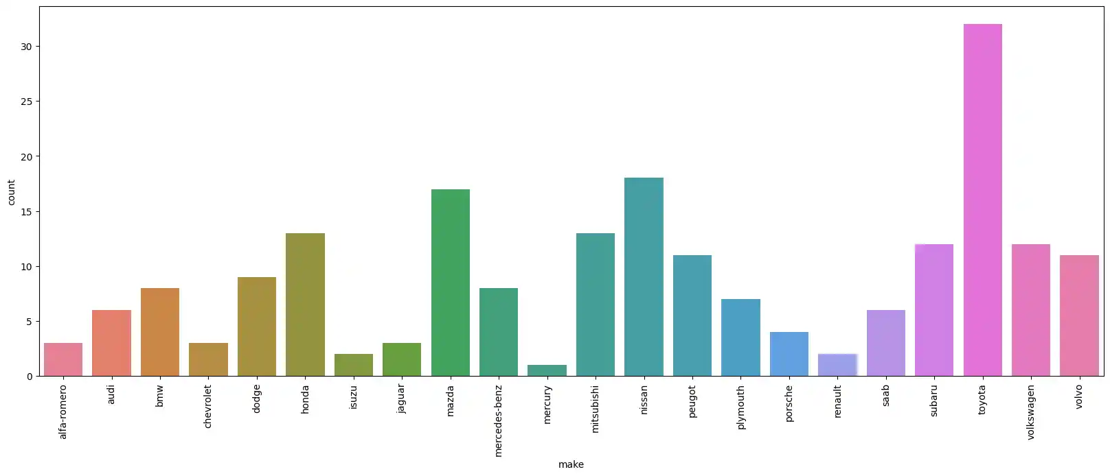
Next, I wanted to see the distribution of car makes. I used the countplot() function to count the number of occurrences for each manufacturer.
sns.countplot(data=df, x='make')
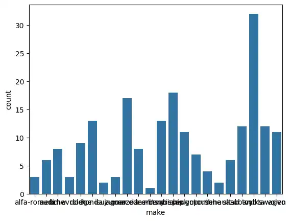
Since the x-axis labels (the car makes) were overlapping and difficult to read, I adjusted the figure size and rotated the labels 90 degrees.
plt.figure(figsize=(20,7))
sns.countplot(data=df, x='make', hue='make')
plt.xticks(rotation=90);
Line Plot
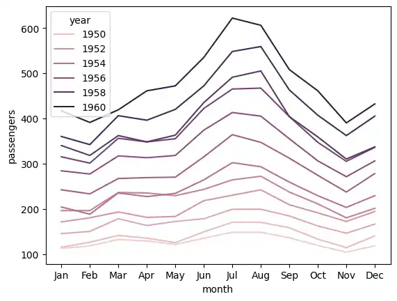
To practice creating line plots, I briefly switched to some of Seaborn’s built-in datasets. First, I loaded the “flights” dataset and plotted the number of passengers over time, using the hue parameter to color-code the lines by year.
flights = sns.load_dataset("flights")
sns.lineplot(data = flights, x = 'month', y = 'passengers', ci=False, hue='year');
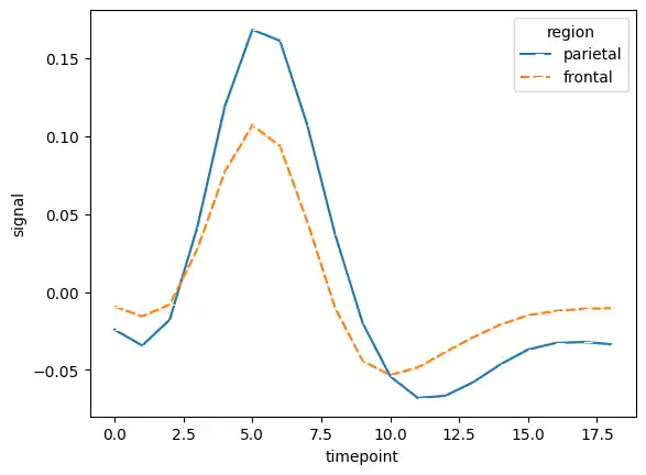
Then, I loaded the “fmri” dataset. I used the style and marker parameters to further distinguish the lines representing different brain regions.
frmi = sns.load_dataset("fmri")
sns.lineplot(data = frmi, x="timepoint", y="signal", hue="region", style="region", ci=False, marker=True)
Exploring a New Dataset: Student Placement
To expand the scope of my project, I decided to import a second dataset. Since I was working in Google Colab, I mounted my Google Drive to access a CSV containing student placement data.
drive.mount('/content/drive')
placement = pd.read_csv('/content/drive/MyDrive/Placement_Data.csv')
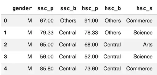
I started by getting a feel for the new data using the head() and describe() functions, just like I did with the automobile dataset.
placement.head()
>>>
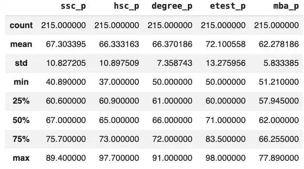
placement.describe()
>>>
I also created a quick count plot to see the ratio of students who were successfully placed versus those who were not, and used value_counts() to see the exact numbers.
sns.countplot(data=placement, x = 'status',)
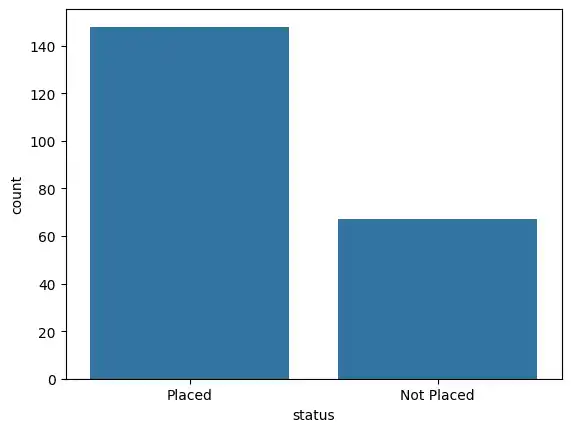
placement['status'].value_counts()
>>>

Advanced Visualizations
With the new dataset loaded, I experimented with slightly more complex visualizations to see how different academic metrics related to job placement.
Comparing Academic Percentages
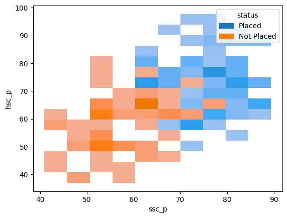
I used a histogram to map secondary education percentages (ssc_p) against higher secondary percentages (hsc_p), separated by placement status.
sns.histplot(data=placement, x='ssc_p', y='hsc_p', hue='status', kde=True)
I also used a line plot to look at this same relationship from a different visual perspective.
sns.lineplot(data=placement, x='hsc_p',y='ssc_p', hue='status')
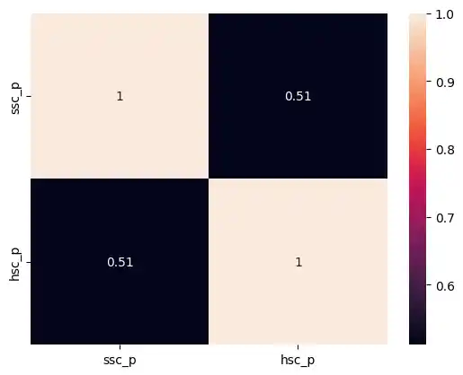
Heatmaps and Correlation
I wanted to explore the direct correlation between secondary and higher secondary percentages. I calculated the correlation and visualized it using a heatmap, setting annot=True to display the exact numerical values inside the grid.
sns.heatmap(data=placement[['ssc_p','hsc_p']].corr(), annot=True);
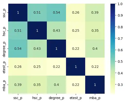
Later, I generated a heatmap for the entire dataset’s correlation matrix. I applied a custom color map (cmap='YlGnBu') to make the stronger correlations visually pop.
sns.heatmap(placement.corr(), annot = True, cmap='YlGnBu')
Subject Streams and Degrees
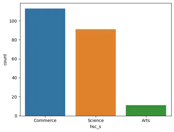
I looked at the distribution of higher secondary subject streams (hsc_s) using a count plot.
sns.countplot(x='hsc_s', data=placement, hue='hsc_s')

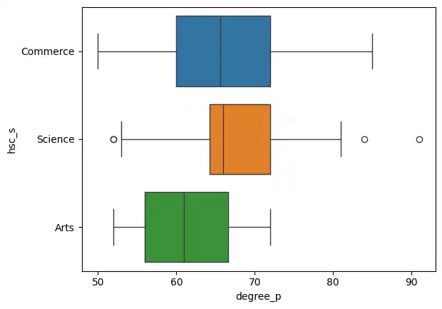
Then, I used a box plot to see how degree percentages (degree_p) varied across those different subject streams.
sns.boxplot(data=placement, y='hsc_s', x='degree_p', hue='hsc_s' )
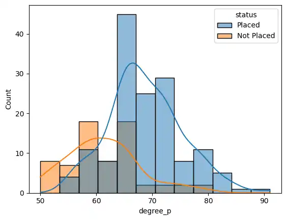
To see how degree percentages directly affected placement status, I used a histogram with a kernel density estimate (kde=True).
sns.histplot(data=placement, x='degree_p', hue='status', kde=True)
Joint Plots and Hexbins
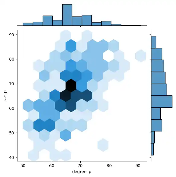
To see the relationship between employability test percentages (etest_p) and secondary percentages (ssc_p), I used a jointplot() with kind='hex'. A hexbin plot is incredibly useful for showing the density of overlapping data points.
sns.jointplot(data=placement, x='etest_p', y='ssc_p', kind='hex')
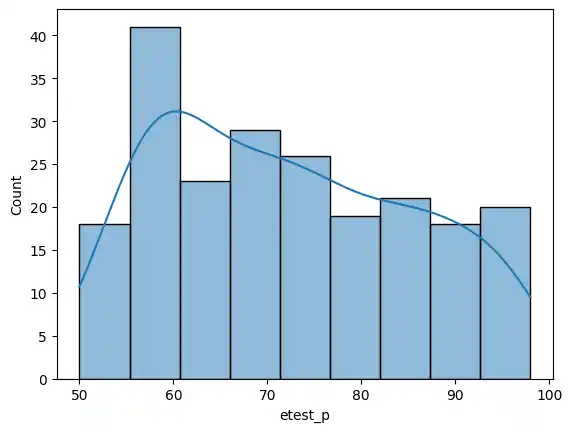
I also viewed the employability test distribution on its own, noting the maximum score in the dataset.
sns.histplot(data=placement, x='etest_p', kde=True)
placement['etest_p'].max()
>>> 98.0
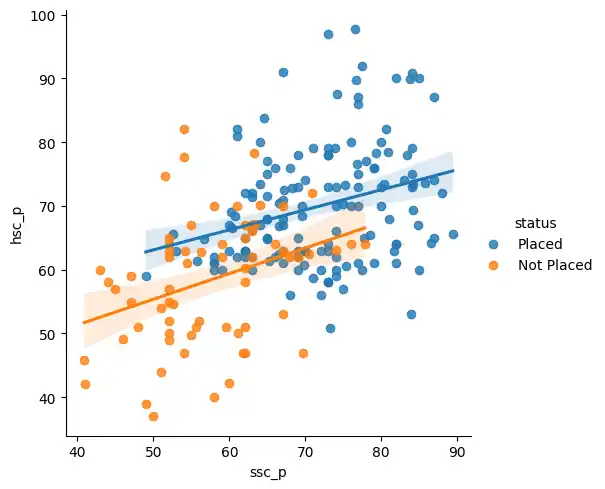
Linear Regression Plots
Finally, I used lmplot() to create a scatter plot with a linear regression line. This effectively mapped out the overarching trend between secondary and higher secondary scores, distinctly separated by placement status.
sns.lmplot(x='ssc_p', y='hsc_p', hue='status', data= placement)
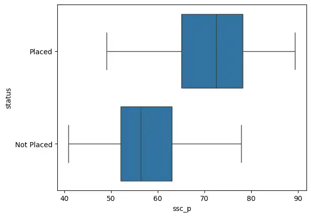
As a final check, I created a box plot to isolate secondary percentages and see their spread against the final placement status.
sns.boxplot(x='ssc_p', y='status', data=placement)